




Design Masterclass Part 2: Flow, Unity & Proportion in Your Space
Dear Reader,
You look at a space and instantly grasp why it works—or why it doesn't.
That intuitive understanding is the goal.
Welcome to Design Masterclass: Part 2.

In our first masterclass, we explored foundational design concepts: color, contrast, value, balance, and emphasis.
Now, we're diving into the principles that breathe life into a space—turning structure into harmony.
🔗 Unity: The Invisible Thread
Unity is what ties your room together. It's the visual glue that makes each element feel like part of a whole.
-
Repeat textures, materials, or colors to create consistency.
-
Think of it like a symphony—each element contributes to the bigger picture.
Not everything needs to "match," but if your design feels scattered, unity might be what’s missing.

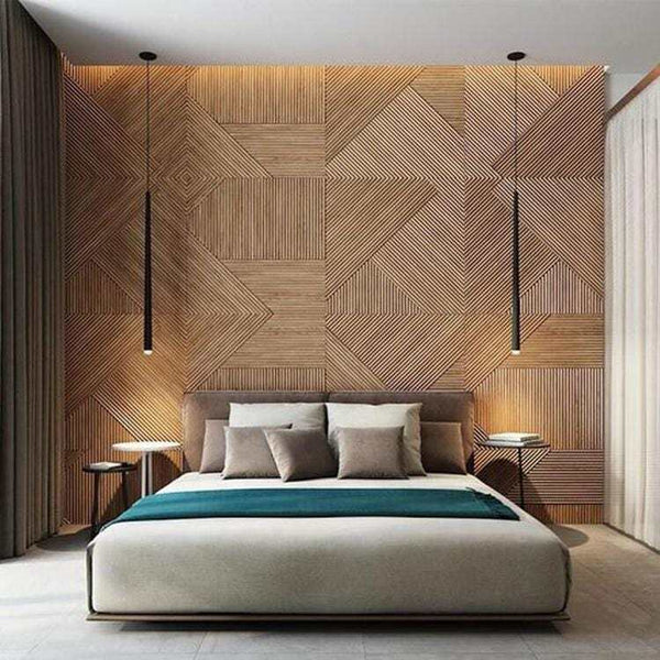
In the chalet-inspired scene above, complementary colors and cohesive materials create a sense of seamless unity.
🔁 Movement (Flow): Visual and Physical
Movement in design refers to two things:
-
Visual Flow — How the eye travels around the space.
-
Physical Flow — How people move through it.
Ask yourself:
-
Does the layout naturally guide you from the door to the seating area?
-
Are there clear walking paths between furniture?
-
Do the design elements lead the eye intentionally?
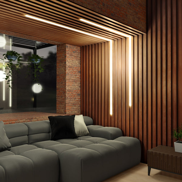
The below image illustrates how physical flow can manifest.

Lighting is a powerful tool here.

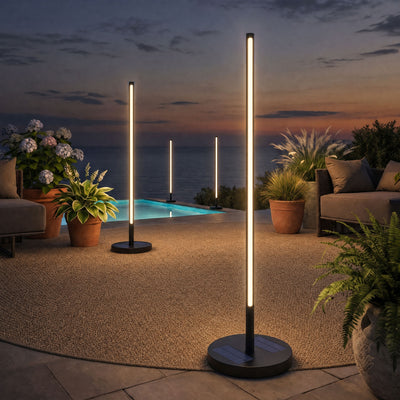
In the image featuring our Landing Lights, notice how the placement of lighting creates visual flow.
Pro-tip: Use spotlights or backlighting to draw natural movement to objects like art or key decor pieces you wish to highlight.
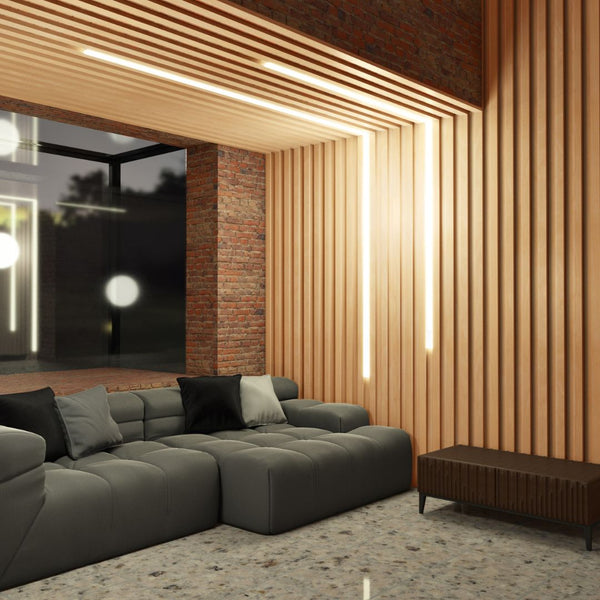
As much as TVs clash with traditional interior design, we're not getting rid of them any time soon. A lot of people don't like TV rim lighting - but if done well I think it can look excellent.

🎶 Pattern (Rhythm): The Pulse of a Room
Patterns give your room energy and movement. They come in many forms—geometry, florals, textures—and give personality to a space.
But: balance is everything.
-
Too much = chaos.
-
Too little = dull.

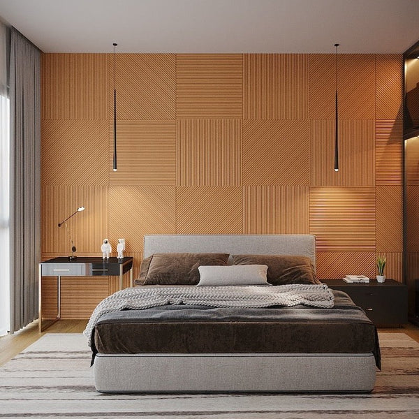
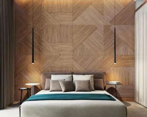
Compare the busy, visually rich scene above to the minimalist rhythm of our Euclid Stained Walls in a Scandinavian-styled room below. One overwhelms; the other invites.

Pro Tip: Let rhythm guide your design without overpowering it.
📏 Scale & Proportion: Size Matters
Design harmony breaks down quickly when elements are out of proportion.
Common issues:
-
Tiny rugs in large rooms
-
Oversized couches in small spaces
-
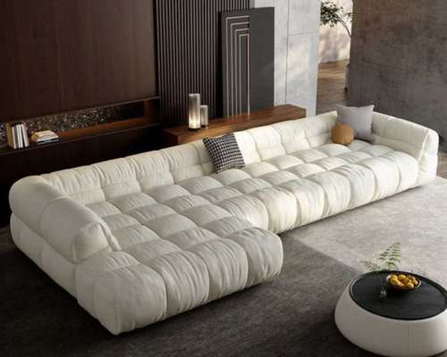
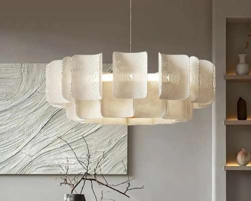
Chandeliers hung too low or too small
Every piece needs to hold its space and contribute to the overall balance of the room.

🏁 Bringing It All Together
These four principles—unity, movement, rhythm, and scale—complete the picture started in Part 1. They’re what bring energy and polish to a room.
But reading is only step one.
Take action.
Try one principle in your own space. Observe the change. Feel the impact.
Great design isn’t about perfection—it’s about progress.
We’ll continue exploring more design truths in the next masterclass. I’ll be right here with you on the journey.
Best,
Ibrahim Hyder
Founder, Articture
www.articture.com
P.S.
Images 1, 4, and 7 contain our products—you can click them to view their product pages directly. Enjoy browsing!