




5 Design Principles That Will Instantly Improve Any Space
Dear Reader,
I was once you.
I wanted to create beautiful spaces but had no idea where to start.
I didn’t study interior design or architecture—I studied math and physics. My classrooms were ruled by logic and precision, where beauty came from equations and symmetry lived in theorems, not the subtle interplay of color, texture, and form.
Like many of us, I turned to Pinterest and home décor blogs, buying pieces I loved—only to find they didn’t quite work together. There was always just something missing.
That’s when I opened Pandora’s box: the world of design.
I realized that truly great design isn’t just intuition—it’s a language with rules, balance, and purpose. You can study it for decades and still find more to learn.
But even a basic understanding of design principles can transform your home.
So let’s begin this masterclass, inspired by both the Elements of Art and the Principles of Design, focusing on the 5 core ideas that will make your space instantly better.
🎨 1. Color Harmony
Understanding color relationships is one of the most powerful tools in design.
-
Complementary colors: Opposites on the color wheel (e.g. blue and orange) that create energy and contrast.
-
Analogous colors: Neighbors on the color wheel (e.g. blue and green) that offer a soft, cohesive palette.
-
Warm vs. Cool tones: Think teal vs. navy—both blue, but with different emotional effects.
💡 Tip: Stick with consistent undertones throughout a room to create a cohesive, polished look.

🌘 2. Value (Light vs. Dark)
Value refers to the lightness or darkness of a color. It's what allows designers to create depth, mood, and variety—even using just one color.
For example, combining light and dark greens gives you visual interest, while maintaining harmony.
Black, white, and every shade in between have design value—literally.

⚖️ 3. Contrast Creates Impact
Without contrast, a space can feel flat and lifeless.
Use contrast to guide the eye and highlight focal points:
-
Color contrast (e.g. white walls with a navy couch)
-
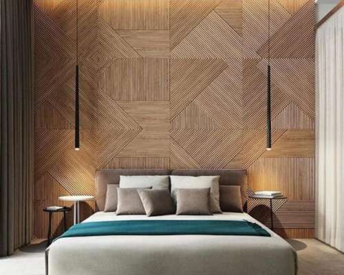
Texture contrast (e.g. a smooth table beside a chunky knit throw)
-
Value contrast (light against dark)
If you want a calm, neutral room, stick to contrasting textures and values rather than bold colors.
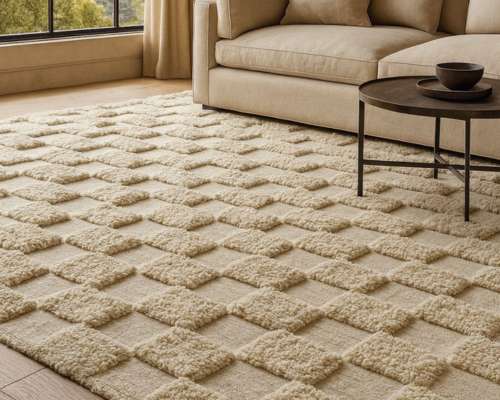
Here’s an example: a gray-on-gray room brought to life entirely through texture—plush rugs, velvet pillows, matte ceramics.

⚖️ 4. Balance, Not Sameness
Balance doesn’t mean everything must be symmetrical.
You can balance a large piece of furniture with several smaller ones, or use negative space as a counterweight.
Consider this:
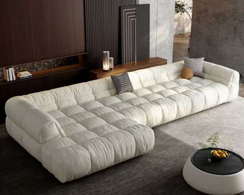
A large sectional sofa can be balanced by a single accent chair and an open walkway. Though not symmetrical, the room still feels stable and intentional.
💡 Tip: When something feels “off” in a room, imbalance is often the cause.

🎯 5. Emphasis (Your Room’s Focal Point)
Every space needs a star—a focal point that everything else quietly supports.
-
Is it a statement art piece?
-
A cozy seating nook?
-
A sleek entertainment unit?
Once you identify the focus, design around it. Keep surrounding elements supportive—not competing.
Design is like stage production: the “lead actor” needs space to shine.

🏁 Final Thoughts
We’ve only just begun.
These 5 principles—color, value, contrast, balance, and emphasis—will lay a solid foundation for transforming any room into a harmonious, functional, and inspiring space.
In our next masterclass, we’ll explore more advanced principles, like rhythm, scale, and unity.
Until then, remember:
Great design is a journey—and we’re here to enjoy it.
Stay with me. I promise, we’ll both be better for it.
Warmly,
Ibrahim Hyder
Founder, Articture
www.articture.com